

User-centered design that turns cluttered, complex tools into clear, effortless workflows.
DootBuddy
A powerful Chrome extension for WhatsApp bulk messaging that helps businesses send personalized messages at scale, boosting outreach and efficiency.
Project overview
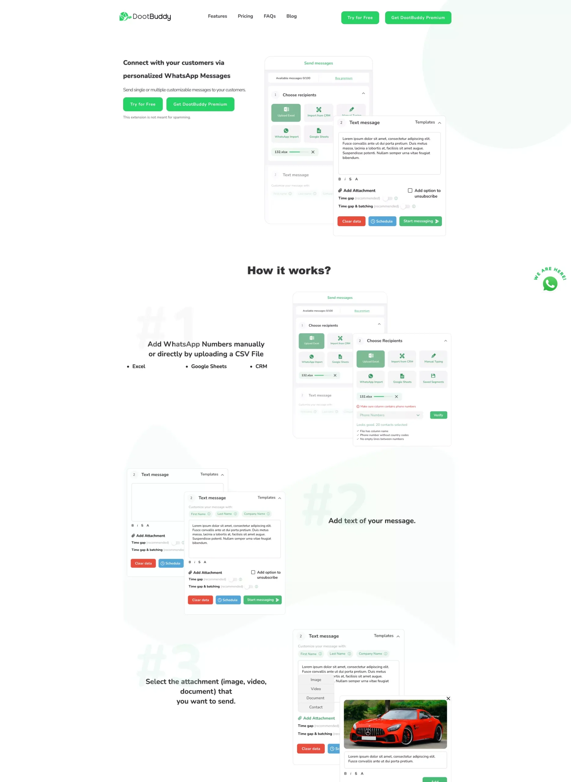
DootBuddy lets businesses, marketers, and educators send personalized messages to thousands of contacts, no manual copy-pasting or saving numbers. But as the user base grew and features piled up, the interface turned cluttered and hard to navigate. The client came to Intobi for a user-centered redesign: simpler key workflows, modern UX/UI standards, and an interface that stays clear and scalable for a broad audience.
fewer messaging errors
40%
Client Context
Domain: Marketing Services
Location: France
Timeline: March 2022 – May 2022
Team: Project Manager, UX/UI Designer, Frontend Advisor

Challenges
- Modern, trustworthy interface – Refresh the outdated UI to reflect a more professional brand image and increase user confidence.
- Streamlined message-sending experience – Redesign complex flows into a clearer, more intuitive messaging experience to reduce confusion.
- UX clarity for non-technical users – Design accessible, self-explanatory interactions that support a broader, less technical audience.
- Scalable design system – Create a flexible interface structure and visual logic that can support feature expansion and growing user needs.
Tech stack
Design & Prototyping


Delivery Approach
This was a redesign, not a rebuild: Intobi took a functional but cluttered WhatsApp bulk-messaging extension and rethought its interface around the people who actually use it – marketers, educators, and small teams – working in Figma and Adobe XD.
UX audit & research
We reviewed where the existing interface confused users and slowed message-sending, then mapped the flows the redesign had to simplify.
A
Anna
UX/UI Designer
Information architecture
We reorganized cluttered screens into a clear hierarchy so key actions stand out and cognitive load drops for non-technical users.
I
Ivan
UX/UI Designer
Interaction & flow design
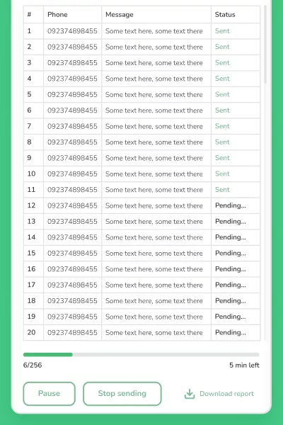
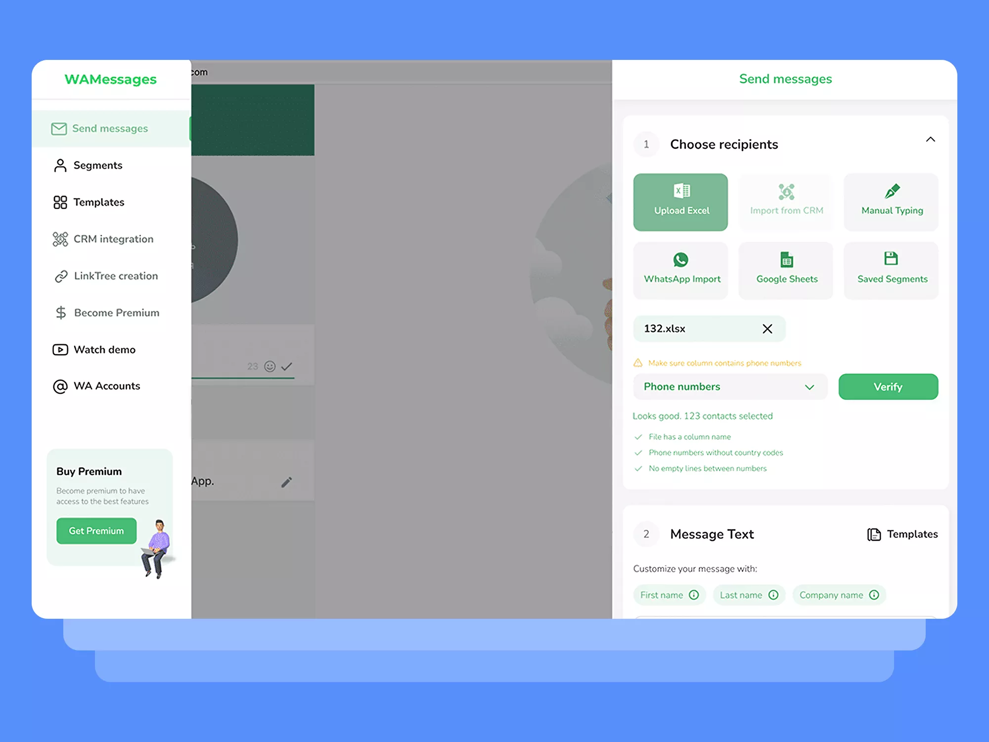
Message creation, contact import, and sending were rebuilt as step-by-step flows with live validation to stop format errors before they happen.
V
Valerii
UX/UI Designer
Visual design system
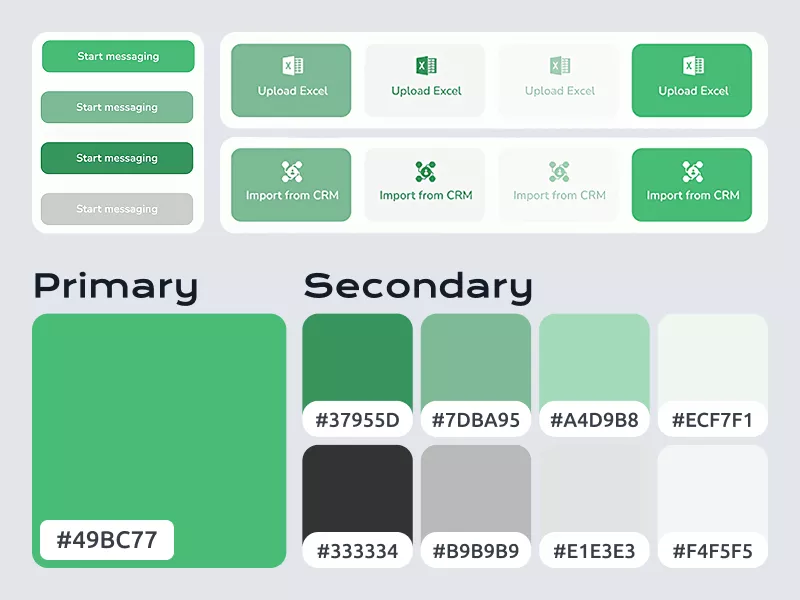
A cohesive system of typography, accessible color, iconography, and spacing unified the product and lifted brand trust.
A
Andrii
UX/UI Designer
Handoff & onboarding
Guided onboarding, contextual tips, and a documented design system were prepared so the tool stays easy to use and simple to extend.
A
Artur
Frontend Advisor
Make a complex tool feel simple?
Contact usKey features
User-centered interface design
The redesigned interface offers a clean, modern, and intuitive experience tailored to a wide range of users. Key elements include a clear visual hierarchy that guides users through tasks without confusion, prioritized key actions that minimize cognitive load, modern UX patterns that support ease of use and retention, and an accessible overall design usable at all skill levels.
Simplified messaging workflows
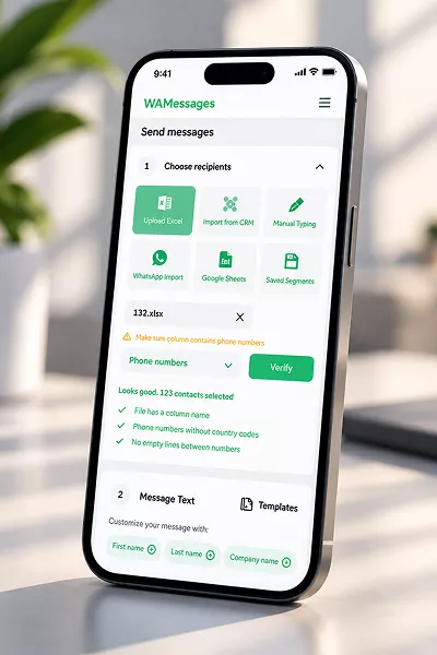
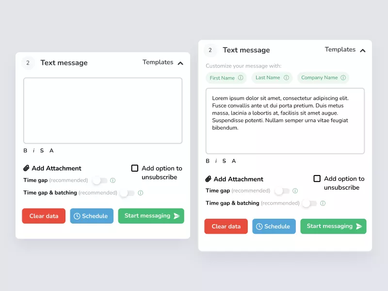
Intobi reimagined the core flows of message creation, contact management, and message sending to accelerate task completion: step-by-step workflows that break complex processes into clear stages, elimination of unnecessary steps and automation of repetitive tasks, intuitive contact import with live validation to prevent format errors, easy controls for personalizing bulk messages, and streamlined attachment management for images, files, or media.
Consistent, sleek, and modern UI
Intobi crafted a cohesive design system to unify the product’s look and feel while enhancing accessibility and readability: modern typography for clarity and a professional tone, a thoughtful color palette balancing brand identity with accessibility contrast requirements, consistent iconography and UI components that build familiarity, and considered whitespace and visual grouping for a balanced, calming interface.
Responsive layout for flexible usage
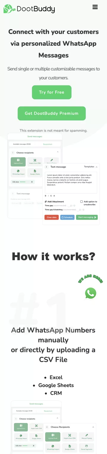
The redesigned interface adapts seamlessly across devices and working environments: adaptive layout behavior reorganizes content for screen sizes from compact laptops to large monitors, scalable UI components maintain clarity across resolutions, environment-aware design accounts for the specific limitations of Chrome extension containers, and optimized, lightweight performance reduces load times and eliminates lag.
User journey designed for smooth onboarding
To reduce barriers for new and less technical users, Intobi focused on a welcoming, supportive onboarding experience: clear, guided flows that introduce essential features step by step; contextual tips and tooltips that appear exactly when and where needed; and simplified instructions that ensure comprehension across skill levels.
Results
The redesign delivered gains in accuracy and reach, plus a consistent visual language that gives DootBuddy a professional, trustworthy feel to match how it performs.
fewer messaging errors
40%
more mobile engagement
30%
What client said

Karen Carter, COO
Dow Chemical Company
“We partnered on a complicated project that involved a cloud migration, new backend architecture, and deploying 7 new enterprise apps.
Intobi excelled in all areas, they were supportive, and diligent in understanding each detail before decisions. I'd highly recommend Intobi to take on any challenge.”
Related Services
End-to-end product design that shapes features, flows, and experience around real user needs.
Modern, responsive website design that looks professional and converts across devices.
Mobile-first design that keeps apps intuitive and consistent on phones and tablets.
Did Intobi build DootBuddy from scratch?
No, the source describes this as a UX/UI redesign of an existing, functional tool whose interface had become cluttered as features were added, not a from-scratch build.
What platform does DootBuddy run on?
The source describes DootBuddy as a Chrome extension for WhatsApp bulk messaging, which shaped the “environment-aware design” work around the specific constraints of Chrome extension containers.
What design tools did Intobi use for this project?
The case lists Figma and Adobe XD as the tools used, consistent with a UX/UI-design-scoped engagement (no separate development stack is listed).
How does Intobi redesign a tool without disrupting the users who already rely on it?
We kept the workflows people knew and rebuilt the interface around them – clearer hierarchy, fewer steps, and live validation- so the tool felt familiar but far simpler, rather than forcing users to relearn it.
Can a UX/UI redesign alone move real metrics?
Yes, for DootBuddy, interface and flow changes cut messaging error rates by 40% and lifted mobile and tablet engagement by 30%, without changing what the tool does under the hood.